YAS / Design System
Details
Junior Product Designer • 2022
Design System · B2B Apps
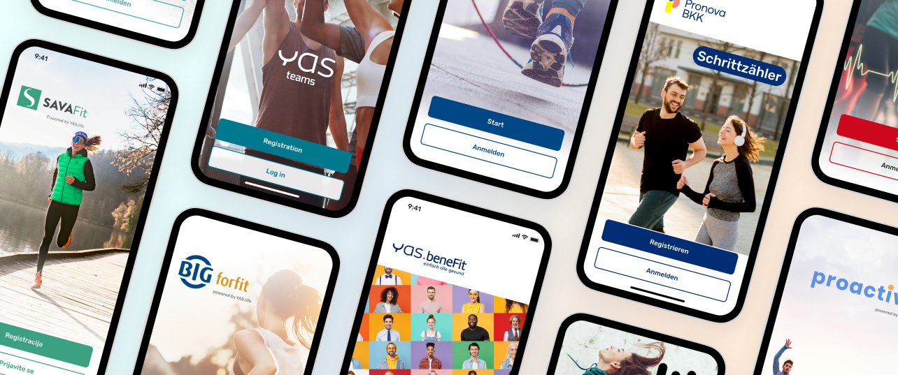
A client had asked for a single vivid red as their primary colour. It was also the colour of every error state in the app. Nobody had flagged it, because nobody was in a position to see it: the company had eleven separate app files, and no one was looking at all eleven at once.
I was the junior designer who started looking. What began as an audit became a unified design system covering all eleven of our client-facing apps, and then something wider than design: a shared resource used by engineering, marketing, and key account management.
01 — The Fragmentation
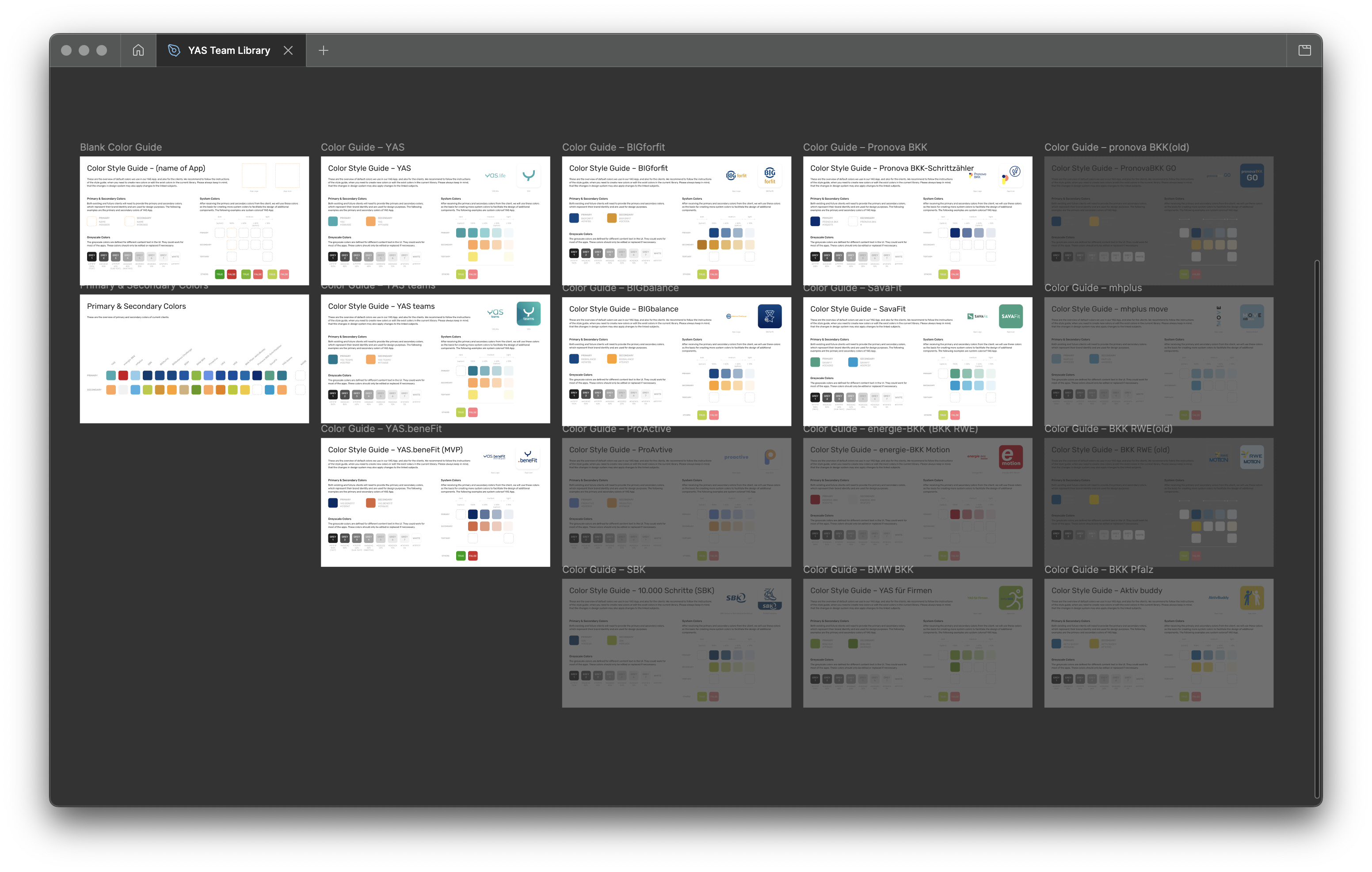
Eleven files, one company, no single source
Every new client meant a new design file. Over the years that had accumulated into eleven separate app files, each with its own components, naming conventions, and assets. Most were variations of the same handful of elements, built and rebuilt from scratch each time.
The cost compounded quietly, which is exactly why it had never been anyone's priority. Designers spent real time managing and syncing near-identical files. When people joined or left, there was no reliable way to tell which file was current. And because only designers knew where anything lived, every other department had to come through us: marketing needing a visual, an account manager preparing client materials, an engineer checking a spec.
We had become a bottleneck by accident. Nobody had designed it that way. It had simply grown.
02 — Building It
A practical system, not a perfect one
I proposed the project myself, with a deliberately modest goal. Not a comprehensive design system. A usable one.
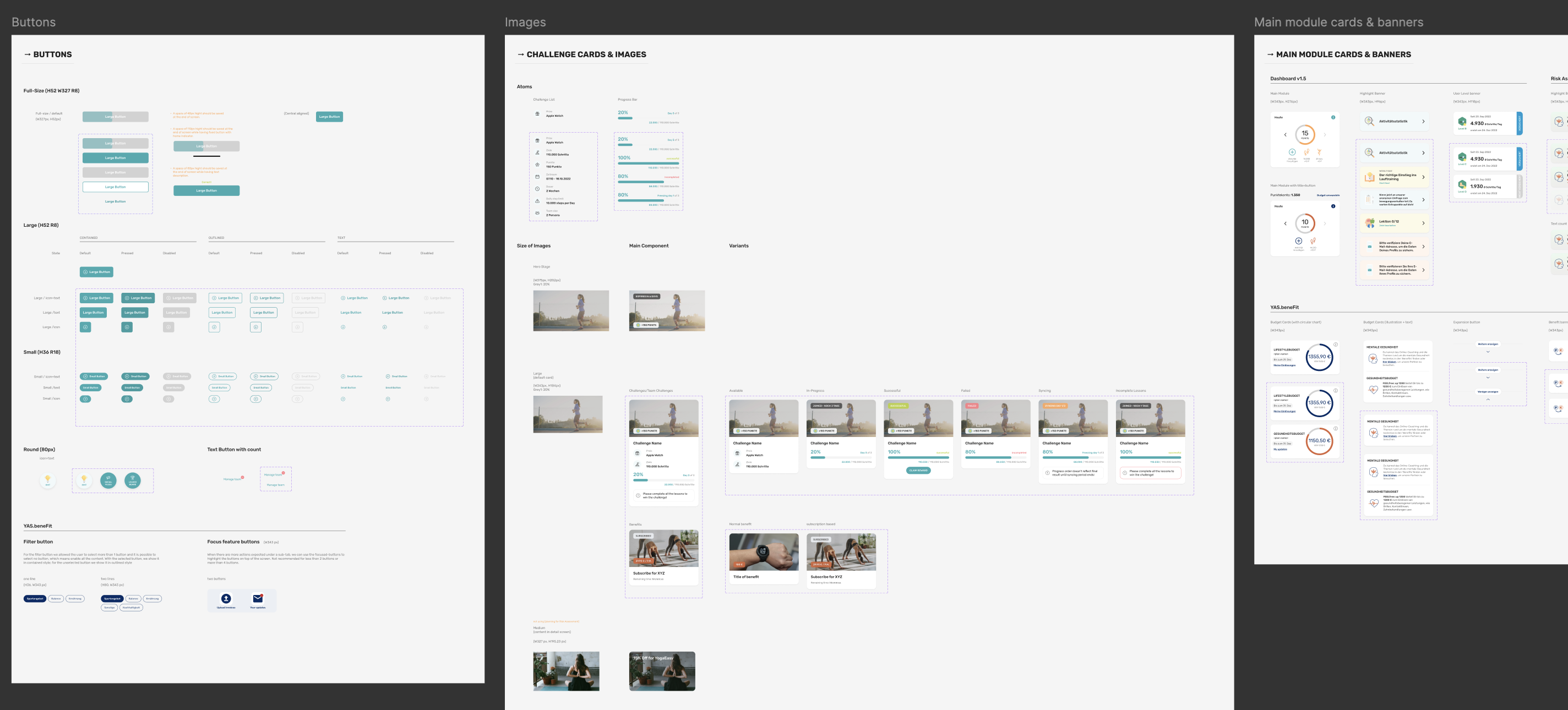
The test I set was simple: could an engineer, a marketer, or an account manager navigate it without a designer translating for them? That question ruled out a lot of elegance in favour of plain naming and obvious structure.
Using atomic design as the framework, I built from the ground up. Typography, spacing, colour, and iconography first, then up through components, documenting naming conventions, states, and usage guidelines for each. The north star was consistency and clarity, not completeness.
03 — What the Audit Turned Up
What do you do with a bug nobody wants fixed?
Auditing eleven apps did not only surface redundancy. It surfaced design bugs. Some were specific to a single app. Others ran quietly across the entire product line.
The red was the clearest. A client had asked for one vivid red as their primary colour and dropped their secondary colour entirely. Nobody objected at the time. But red was already carrying a meaning in our system: it was the error state. In that app, a primary action and a warning looked the same. A user could reasonably read "confirm" as "something has gone wrong".
The product worked. The client had signed off. There was no incident to point to and no budget to fix it, and as a junior designer I was not going to reopen a closed client decision on the strength of my own audit.
So I documented it instead. I added a notes layer to the design system, capturing edge cases like this one as annotated guidelines. It was not there to relitigate old decisions. It was there so the next client onboarding conversation would be better informed, and so the next designer would not make the same call without knowing what it cost.
04 — Rollout
Not a tool for designers
When the first version was ready, I presented it at a company all-hands. The framing mattered to me more than the contents: this was not a tool for designers. It was infrastructure for everyone.
Marketing could find assets without filing a request. Account managers could pull materials before a client meeting without looping in the design team. Engineers had one reference point for component specs. The design system turned out to be less a design deliverable than a communication platform that happened to have been built by a designer.
The strongest response came from engineering, which I had not predicted. Across departments the change had the same shape: less back and forth, fewer requests for files that should have been findable, and more autonomy for the people who actually needed the assets.
The requests that did still reach us changed shape as well. Answering one had meant at least one to two hours of a designer's time, working out which file was current, hunting down the right component, exporting it. Afterwards it took a few minutes. Fewer requests, and each one far cheaper to answer. Across a week that added up to a meaningful amount of time handed back to actual design work.
05 — Reflection
Design systems are not really about design
They are about how an organisation shares what it knows, and how much friction it is willing to tolerate along the way. The visual and component work was the easier half. The harder half was working out what each team actually needed from a shared system, and building something that served all of them without requiring a designer in the room.
Looking back, I would spend more time up front interviewing the non-design stakeholders, engineering, marketing, and key account management, before building rather than after. I made reasonable assumptions and most of them held. But asking directly would have made the system more robust from day one.
The system outlived the project. Two years later, building YAS.beneFit against a one year deadline, it was the component thinking established here that made it possible to modularise the dashboard rather than rebuild it.
Thanks for reading.
 →
→