Team Challenge / Feature Development
Details
Senior Product Designer, Project Manager • 2025
Digital Health · B2B Apps
Five client apps. Thousands of users in the middle of live competitions. We had to rebuild the feature underneath them without interrupting a single one.
Team Challenge is a step-count competition that runs across our B2B health apps: users form teams, track their daily steps, and race either for total distance or to reach a destination first. After several years in production, it needed a serious overhaul. It also could not stop running while we did it.
01 — The Constraint
The feature could not pause
At any given moment there were teams mid-competition, step counts accumulating, destinations half reached. Whatever we changed had to arrive underneath people who were already using it.
The pressure to change came from two directions at once.
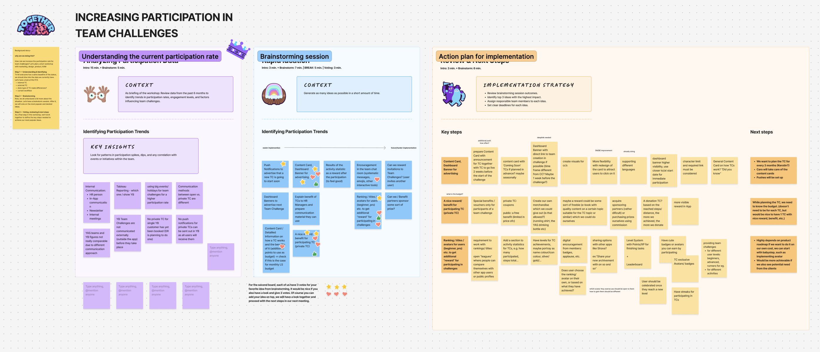
Internally, leadership had flagged that several of Team Challenge's secondary features had quietly fallen out of use. Years of additions had accumulated into interface weight that cost attention without returning much.
Externally, clients wanted something more fundamental. They wanted users to be able to join a challenge after it had already started. The original design locked team formation to the window before a competition began, so anyone who missed the signup period was simply excluded. Clients could see the cost of that in their participation numbers.
The brief, in one sentence: make Team Challenge feel less like a rigid competition and more like something you could step into at any point.
That turned out to be the easy part to say.
02 — Mapping What Existed
We set out to draw a map, and found there wasn't one
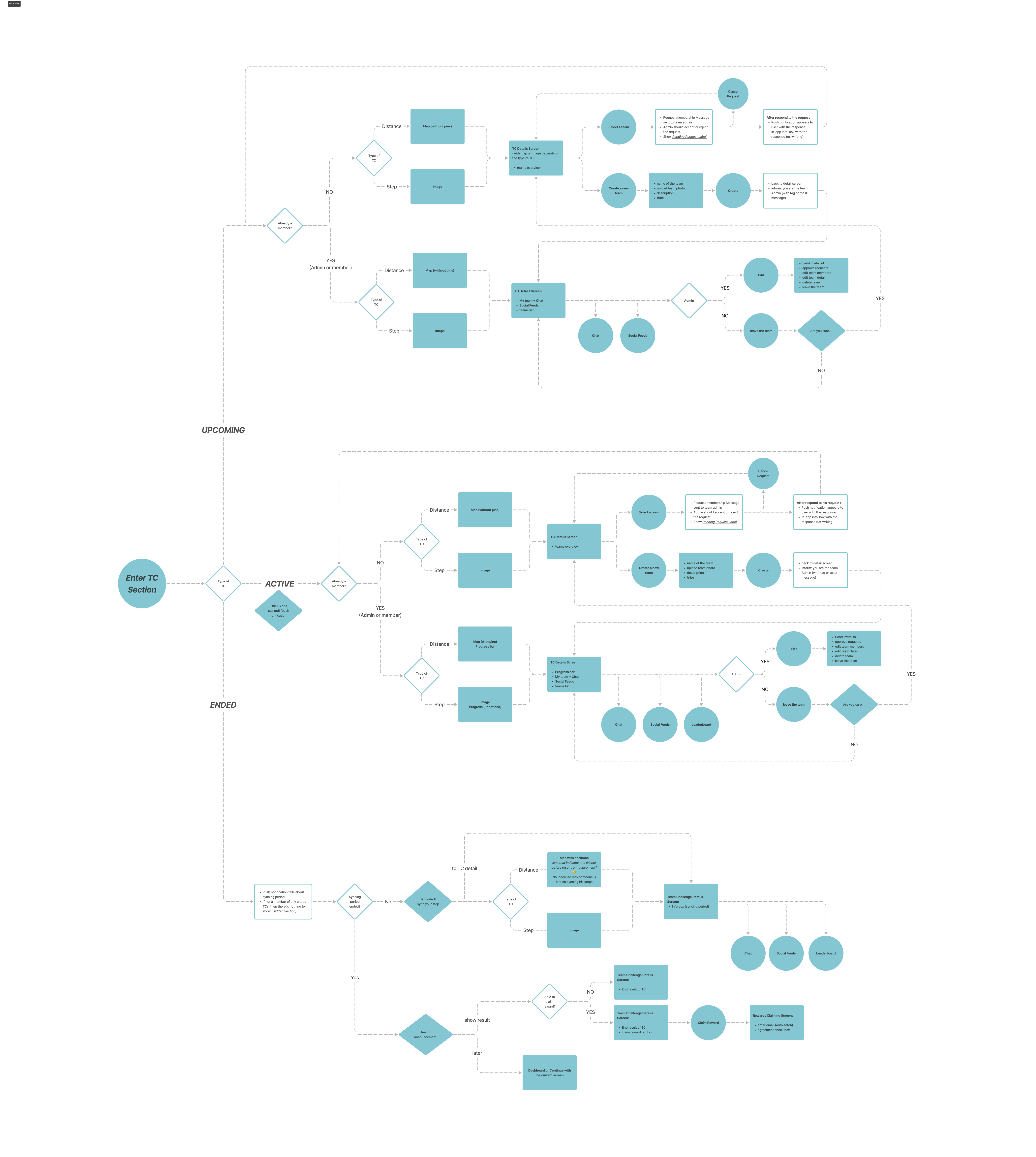
Before touching any designs, my co-designer and I began charting the existing feature: every path a user could take, from discovery through to completion.
It turned out to be the most valuable thing we did, for a reason we had not anticipated.
Much of the original design documentation no longer existed. People had left, files had moved, decisions had been made in conversations that nobody wrote down. The flow chart stopped being a planning artifact and became an excavation, the only reliable record of what the feature actually did.
What surfaced was more useful than a redesign brief. We found legacy decisions that had made sense years earlier and no longer did. We found gaps in the experience that had never been formally identified, because no single person had ever held the whole flow in view at once. And we got the thing we needed most under a tight timeline: a way to rank which parts of the feature deserved attention first.
Only once we had the full picture did we start redesigning, component by component, in order of impact.
03 — The Fairness Call
Joining late is not a scheduling problem
Opening the door mid-competition sounds like a matter of unlocking a window that used to be closed. It isn't. The moment latecomers can join, the fairness of the whole competition is in question: teams have already accumulated distance, standings have taken shape, and the people who committed on day one have a reasonable claim to a contest that isn't reshaped around them.
The instinct is to protect that. We looked at it the other way around.
Everything we had heard from users over the years pointed in the same direction: being locked out of a challenge entirely is a worse experience than joining one already in progress. Exclusion is absolute. Imperfect fairness is a trade-off people accept, particularly when the alternative is watching your colleagues compete for weeks with no way in.
Then the mechanics closed most of the gap anyway. Before joining a team, a user cannot see its ranking or its member details. Without that information there is no way to shop for the winning team, which is where the meaningful unfairness would have come from. The advantage we had been protecting against was one that users had no practical way to exploit.
So we opened it up. Users can now join a challenge after it has started, and in the feedback that followed, both participation and satisfaction rose substantially.
04 — Shipping in Phases
Shipping it in pieces was the harder half
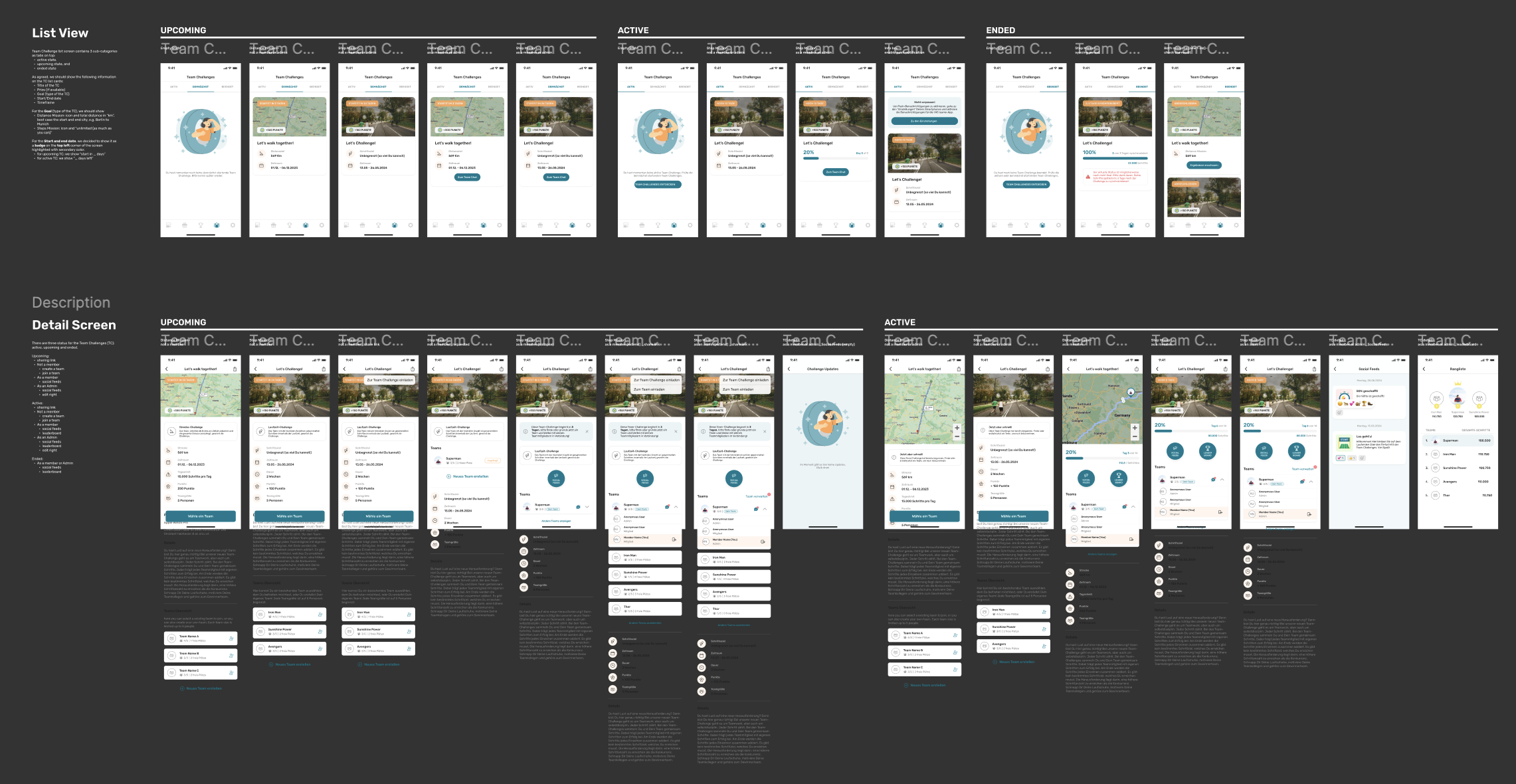
Team Challenge 2.0 was too large to ship at once. We broke it into two to three sequential releases, each of which had to go live without disrupting users who were already competing.
The design coordination was manageable. The project management was a steeper learning curve, and it was my first time doing it at this scale.
Every release needed a clear answer to a question I had never had to ask before: what does this actually touch? Some changes were frontend only. Some required backend work. Some reached into the back office. Without that map, sequencing the phases correctly and explaining the plan to engineering would have been guesswork, and guessing wrong meant breaking a competition that real people were in the middle of.
I closed the gap by working alongside the engineering team from the start and setting up a short daily briefing to keep everyone aligned as the releases went out. It was not a sophisticated system. Its value was entirely in the consistency: problems surfaced within a day instead of at the end of a sprint, and decisions could be made while they were still cheap.
05 — Results
Team Challenge 2.0 shipped across all five apps, reaching thousands of users.
The clearest signals did not come from a dashboard. Users told us directly that the feature had improved, and participation and satisfaction both rose once people could join a challenge already in progress. Clients kept renewing year after year, and challenge participation climbed steadily across the apps.
For a feature that had been running for years, a redesign that grew engagement rather than disturbing it was the result that mattered.
06 — Reflection
Delivery is design material
Redesigning a feature is one thing. Rolling that redesign out across five apps, in sequence, without interrupting anyone already using it, is a different discipline.
The order we shipped in, what went into which release, which improvements could wait a month: those choices shaped the user's experience as directly as any screen did. A good design that arrives in the wrong sequence is a bad experience. I understood that abstractly before. Owning it made it concrete.
The daily briefings were the smallest habit with the largest effect. Frequent, low-ceremony communication did more than keep the schedule intact. It built enough trust that people raised problems early, while they were still small enough to solve quietly.
Thanks for reading.
 →
→