YAS.beneFit / MVP Case Study
Details
Senior Product Designer, Project Manager • 2024
B2B Apps · Health
A conversation between our CEO and a prospective client turned into a deadline. One year to build a corporate wellness product, sign its first client, and prove there was a real market underneath the idea. I joined on day one as the lead designer, and as the project manager.
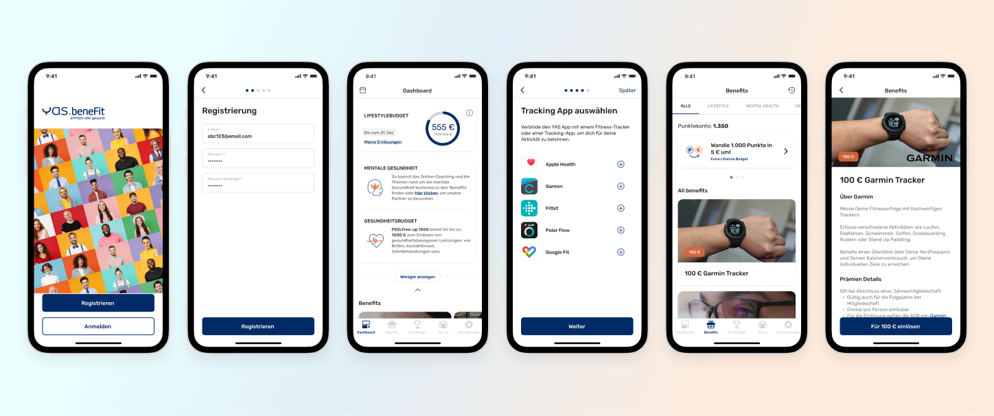
YAS.beneFit gives employees a flexible budget across lifestyle, health, and mental wellness, so they can redeem the benefits they actually want. For employers it is a retention tool and a way to build a culture of wellbeing, reinforced by gamification that turns healthy habits into redeemable points.
01 — The Bet
One year, and three requirements that pulled against each other
I was there for all of it: the initial proposal, the concept phase, the full design process, internal alignment, testing, launch.
The opportunity had come from an unexpected direction. Our CEO had been talking to a potential client and found an untapped market sitting between two things we already understood: corporate insurance brokering, and the gamified wellness platform we had already built. The hypothesis was good. The constraints were the problem.
Inside that one year, three requirements pulled against each other. The new app had to feel meaningfully different from anything we had shipped before. It had to preserve the core features that made the existing platform work. And it had to stay flexible enough for client customisation we could not yet specify. All of it on limited time, limited budget, and limited engineering capacity.
Something was going to have to give. The only real question was whether we would choose it, or discover it too late.
02 — Planning the Trade-offs
We decided what to cut before we had to cut it
Rather than moving straight into design, I organised and led a series of structured hackathon workshops.
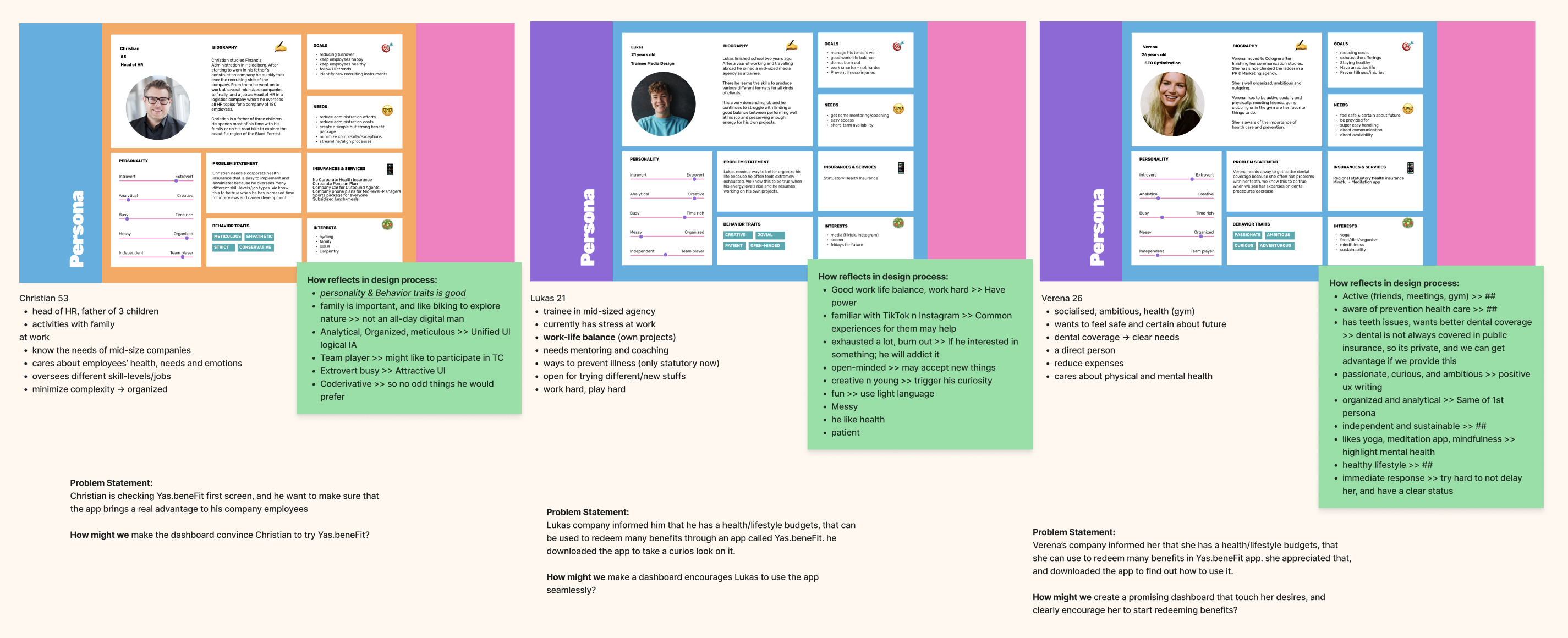
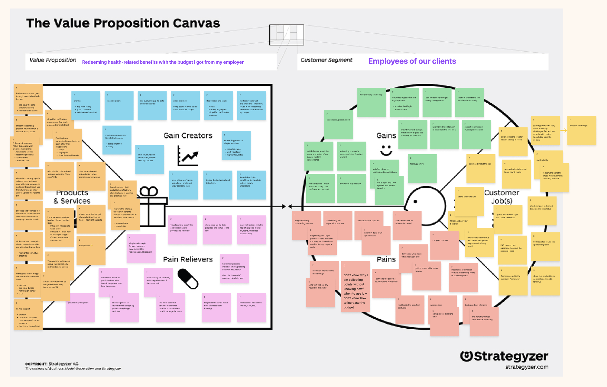
Across several ideation sessions we worked through Value Proposition Canvases, persona development, and user journey mapping, bringing in perspectives from across departments and surfacing what each stakeholder actually needed from this product. Then we ranked every feature against two axes: development complexity and business impact.
That ranking was the real output. Not a roadmap, a decision framework. When the constraints tightened later in the year, and they did, we were not arguing from scratch about what mattered. The goal was never to design everything at once. It was to make sure that when we had to cut something, we knew exactly what we were cutting and why.
03 — The Dashboard
I argued to rebuild it. We didn't.
The sharpest conflict of the project was over a single screen.
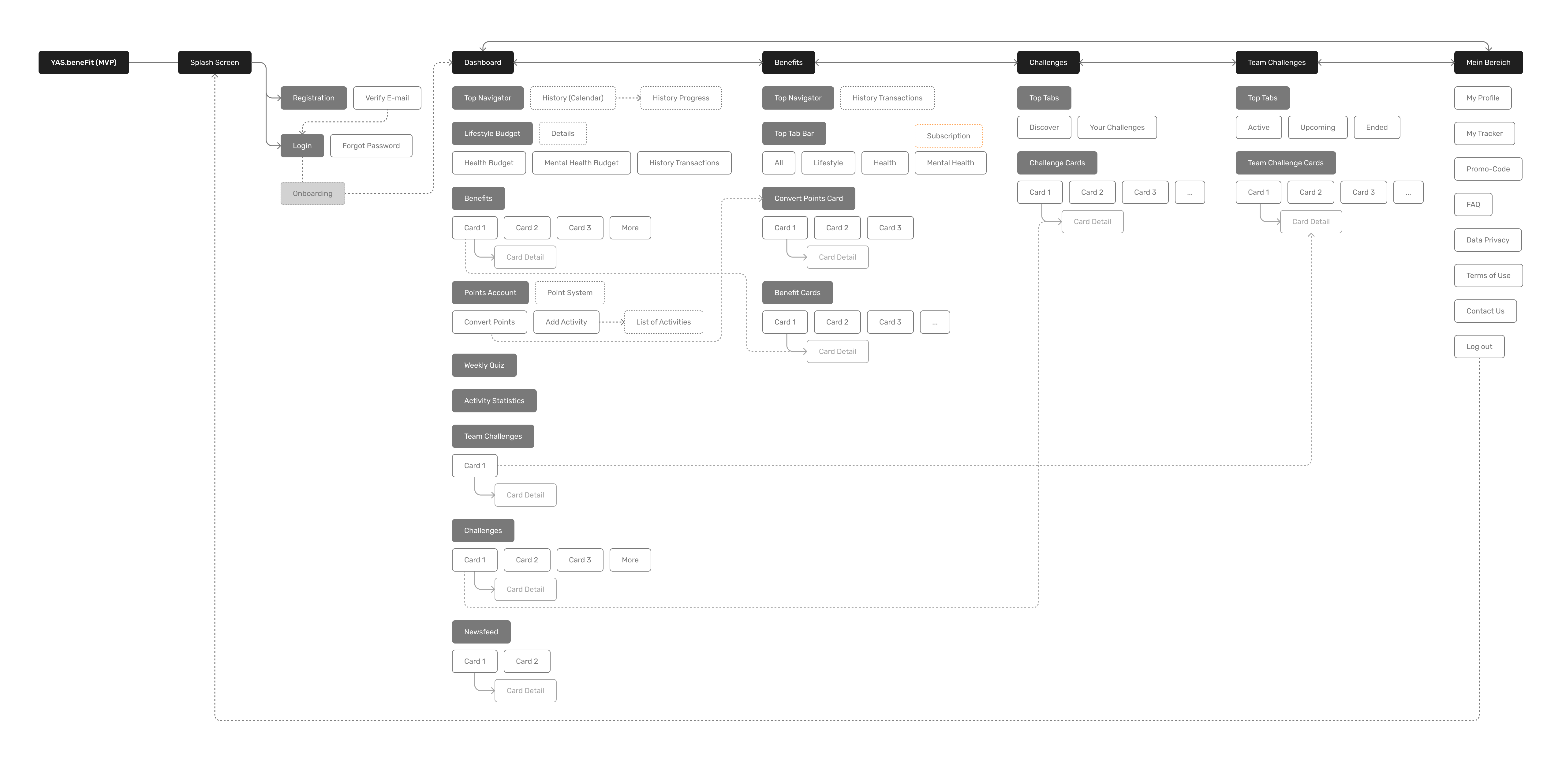
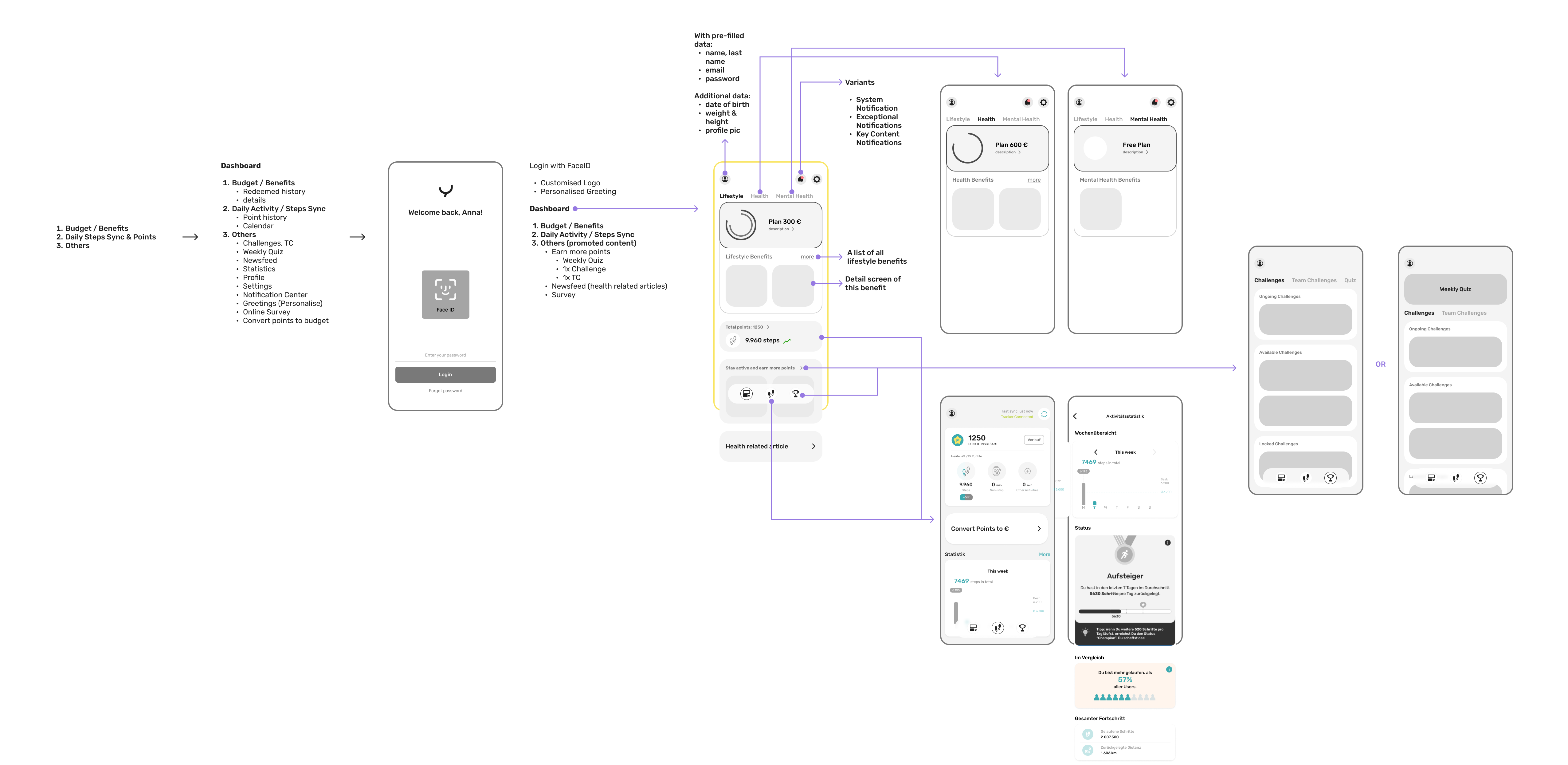
The dashboard is the product's most critical surface and the first thing every user sees. The version we had needed significant work to meet what the new product was trying to do. But rebuilding it properly meant engineering refactoring that we did not have the time or the budget for.
My instinct was to fight for it. Do it now, do it right, avoid compounding technical and design debt that someone would have to pay down later. That is usually the correct instinct.
We worked through the short, medium, and long term options with the engineering team, and I changed my mind. Instead of a clean rebuild, we modularised the key design components inside the existing framework.
Concretely, that meant taking the content card template we had already built for the Reward feature and applying it to the benefit cards, instead of designing a new card from scratch. The template needed work of its own, so we tightened the original reward card at the same time: defining the image specifications for uploads in the back office, updating the card's states, setting the rules for how cards are ordered, and deciding where they would ultimately sit on the dashboard.
Most of that never surfaces. A user opening the app sees a benefit card, not a system decision. What it left behind is one card model shared across both features, specified well enough that the next feature needing content cards can adopt it rather than reinvent it.
It was not the ideal solution. It was the right one for where we were, and it made the next problem smaller instead of larger.
04 — Results
It shipped, and then it sold
Getting a working MVP from concept to the App Store inside the year was not a given. That alone was the first milestone.
We had no formal analytics at launch, so we read behaviour instead. Active usage climbed from roughly two or three sessions a week to at least once daily. The clearer signal was inventory: popular benefits started selling out. When users are redeeming enough to clear stock, something is working.
In the product's second year, YAS.beneFit signed its first external client. The hypothesis that started as a conversation had held up.
05 — Reflection
I stopped thinking in screens
This was the first time I led a full product development cycle as the primary designer, and it changed what I think design work is.
I stopped thinking in screens and started thinking in decisions. Every choice carried a product implication, a business consequence, an engineering cost. Learning to hold all of that at once, instead of optimising the interface in isolation, made me a different kind of designer.
The part I did not expect to value was the facilitation. Keeping departments aligned, resolving disagreements without losing momentum, finding the option that engineers and stakeholders could both live with. My design background turned out to be an asset there in a way I had not predicted: thinking visually and structurally made it easier to translate between teams instead of stalling between them.
If I could change one thing, I would have pushed harder for defined success metrics before launch. The signals we had were real, but agreed measures would have made the story easier to tell, and the next iteration easier to prioritise.
Thanks for reading.
 →
→